Autocomplete Control
An autocomplete control is a user interface element, often used in forms or applications, that provides suggestions or completions for user input as they type. The control predicts the rest of a word or phrase based on the characters entered by the user, offering a list of suggestions that match the input.
This control is commonly used to enhance user experience, reduce errors, and speed up data entry. Using Autocomplete controls, users can benefit from predictive suggestions.
There are basically three steps to create an autocomplete control on the form:
- Create a Datasource.
- Bind your Datasource with a control.
- Set the properties and perform the configurations for the autocomplete control.
Steps to create an autocomplete control on the form to assist users in finding a person in EmpowerID.
Follow these steps to create an autocomplete control on the form to assist users in finding a person in EmpowerID.
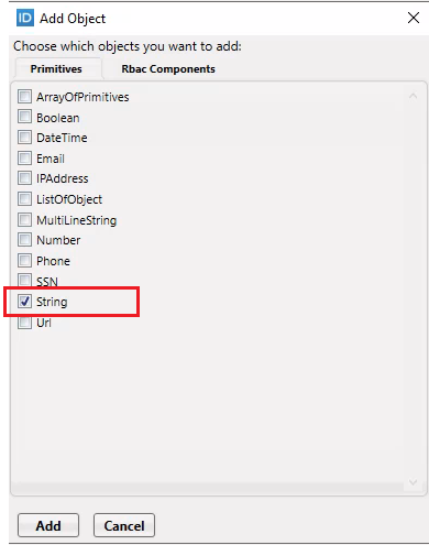
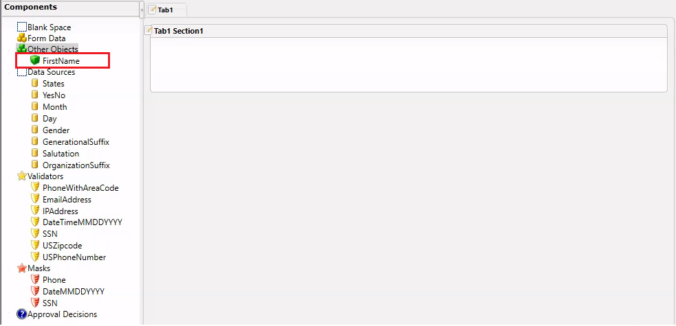
- On your Form, add an object of type String.
-
Double-click on it, rename it, and assign any name. In our case, we are naming it FirstName.
-
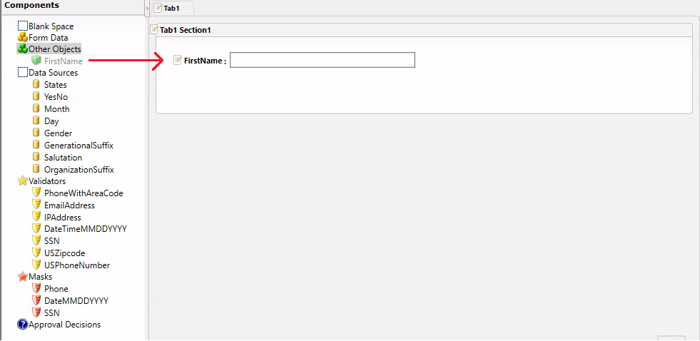
Drag and drop FirstName onto the Form Designer.
-
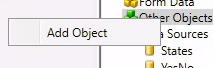
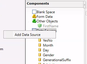
- Right-click on the Data Sources section and select Add Data Source.
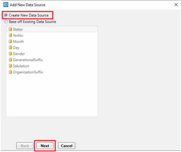
- The Add New Data Source dialog box will appear. Keep the first option selected and click Next.
-
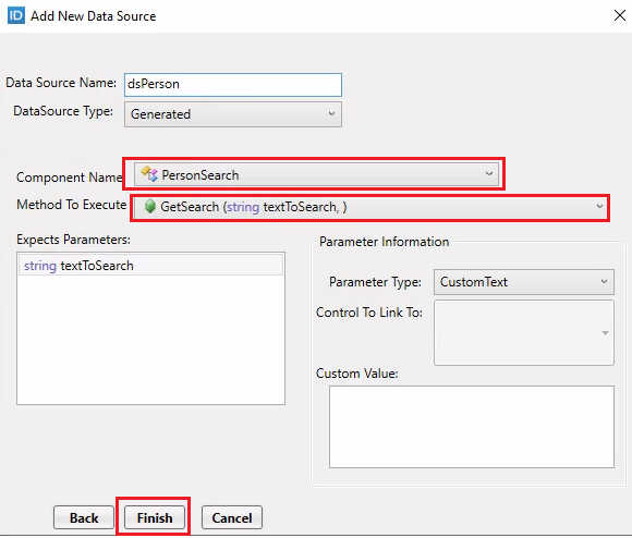
Provide a name for your Data Source, e.g., dsPerson. Select Generated as your Data Source Type. From the Component Name, choose PersonSearch and from the Method to Execute, select GetSearch (string textToSearch). Finally, click on the Finish button.
-
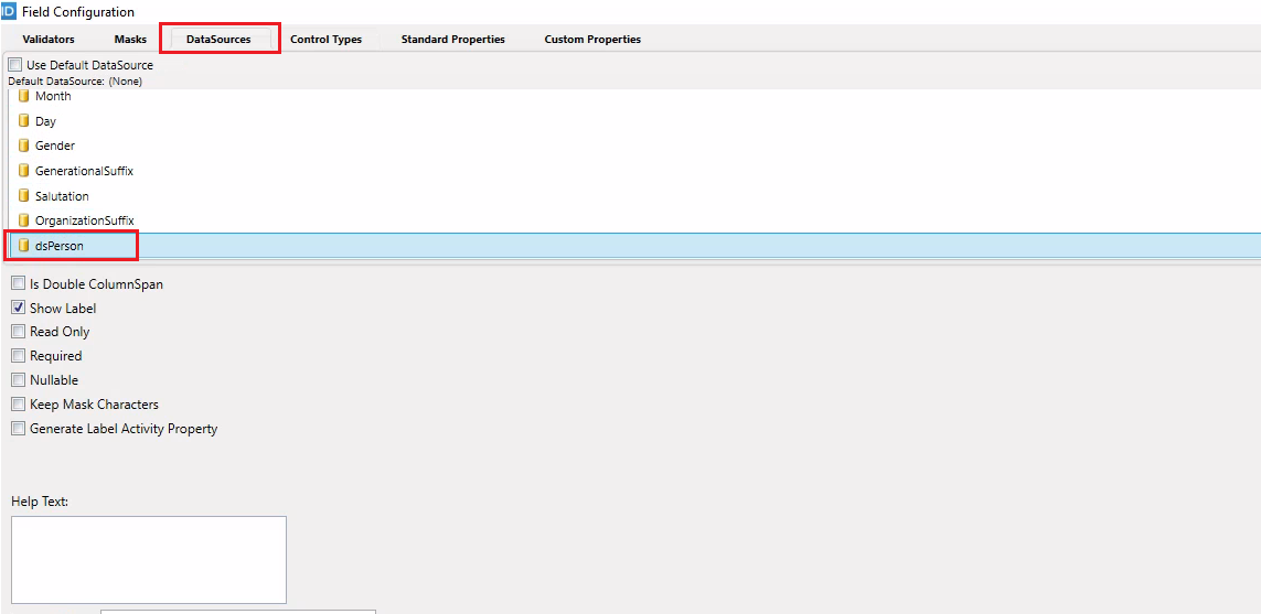
Right-click on the FirstName field and select Edit option.Then go to the DataSources tab and choose your newly created Data Source (dsPerson).

-
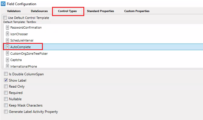
Navigate to the Control Types tab and select the AutoComplete control.
-
Go to the Standard Properties tab and set the properties as follows:
| Property | Value |
|---|---|
| Display Field | FriendlyName |
| Selected Value Path | PersonID |
| Item Template Name | Leave Empty |
| Search Parameter Name | textToSearch |
| View One Link Type | Leave Empty |
| Initial Value DataSource | Leave Empty |
| Initial Value DataSource Display Field | Leave Empty |
-
Click OK on the Field Configuration Dialog box.
-
Save and Publish your Form and restart the Workflow Studio.
-
Now create a Workflow and drag your Form onto the Workflow Designer pane and Publish your Workflow.
-
Now publish the Form and the Workflow on the EmpowerID Web.
-
Reset IIS.
-
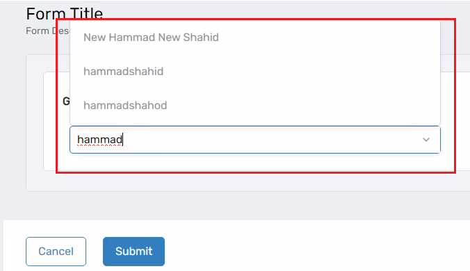
Run your Workflow and see how the Autocomplete Control appears in the UI.
Enhancing the Autocomplete Control
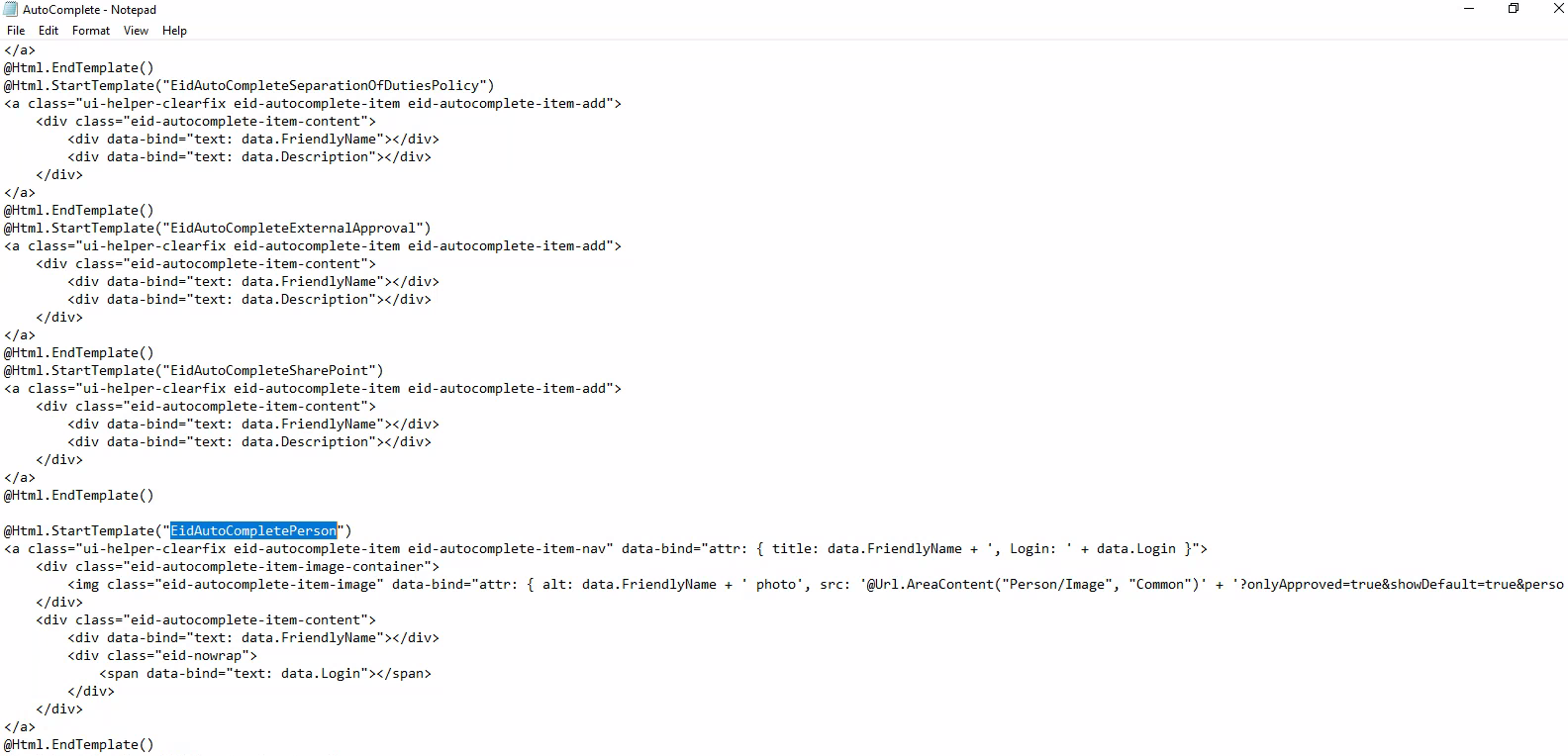
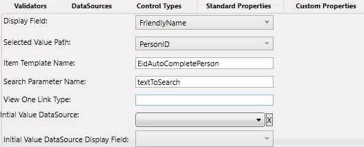
- Right now, it is showing just the Friendly Name of a Person. What if we wanted to show the Login Name along with the Friendly Name of a person. We could do that using the Item Template Name property. Go to your autocomplete control again and edit the properties as below.
| Property | Value |
|---|---|
| Display Field | FriendlyName |
| Selected Value Path | PersonID |
| Item Template Name | EidAutoCompletePerson |
| Search Parameter Name | textToSearch |
| View One Link Type | Leave Empty |
| Initial Value DataSource | Leave Empty |
| Initial Value DataSource Display Field | Leave Empty |
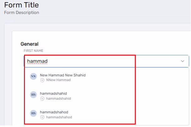
- Publish your Form from both the Workflow Studio and the EmpowerID Web UI. Run your Workflow and type any name in the Autocomplete Control. The control will now display both the Friendly Name and the Login Name.
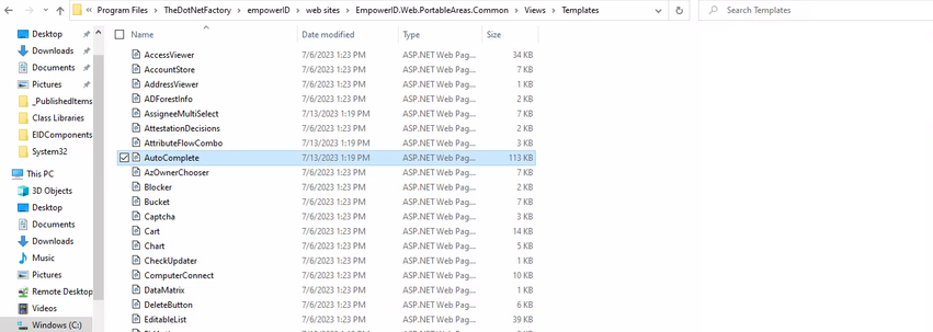
To see where all the templates are present. Go to this file AutoComplete and open it to see all the templates.
File is present on this path: C:\Program Files\TheDotNetFactory\empowerID\web sites\EmpowerID.Web.PortableAreas.Common\Views\Templates